Die Aufgabe.
Die Ruhrfestspiele Recklinghausen sind eines der ältesten und renommiertesten Theaterfestivals Europas. Unzeitgemäße Kommunikationskanäle und ein in die Jahre gekommenes Erscheinungsbild stehen einem weiteren Wachstum im Weg – bis jetzt.
Die Lösung.
Tiefgreifendes Rebranding und Erarbeitung eines typografischen Konzepts auf Basis eines jährlich neuen Zweiklang-Mottos. Statische und animierte Umsetzung in sämtlichen Medien, inklusive eines 250-seitigen Programmbuchs.
Leistungen:
_Brand Identity Creation
_Logo Design
_Brand Strategy
_Typografie
_Print Design
_Digital Marketing
_Motion Design
_Social Media
Das Ergebnis.

Umfassend digitalisierte Kommunikation

Erfolgreiche Marken-Verjüngung
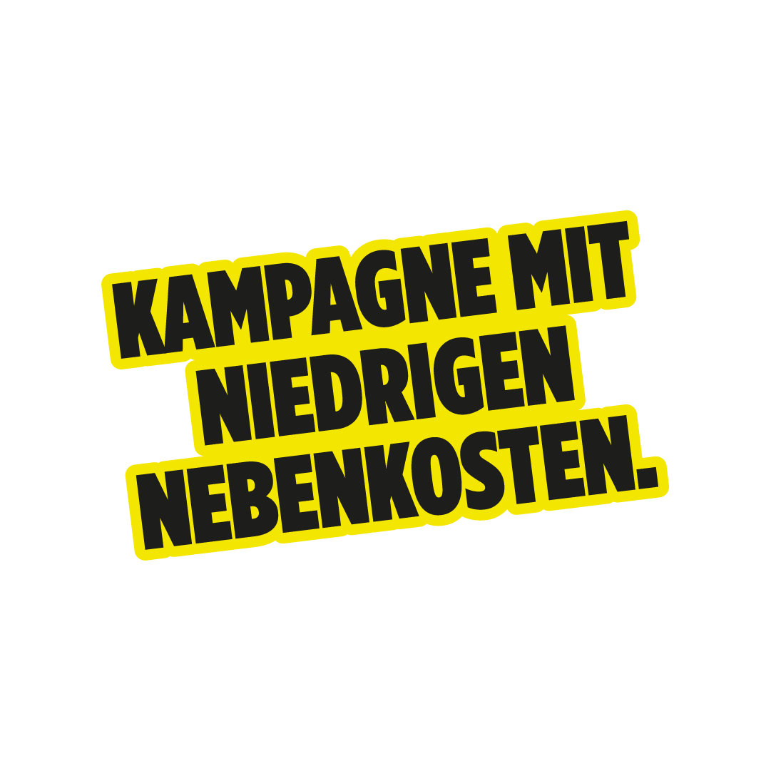

Für jedes neue Jahr der Festspiele wird eine einzigartige handgemachte Schrift gestaltet.

Eine Priorisierung von Digitalmaßnahmen macht die Festspiele zukunftssicher.

Word of Mouth Marketing deluxe: 50.000 Spielzeit-Bücher sind jedes Jahr innerhalb kürzester Zeit vergriffen.